
 Pen and ink, rendered two months before Flora's death in July 1998.
Saturday, June 23, 2007
Tuesday, June 19, 2007
Flora drummer (1955)
 Printed, matted and framed by Yee-Haw Industrial Letterpress,
Knoxville TN, exhibited at NYC Stationery Show May 2007,
to introduce a limited line of Flora cards and calendars.
Production underway, projected completion late July.
Friday, June 15, 2007
Mount Adams Winter Scene (1937)
 Mount Adams Winter Scene (1937) was painted by Flora while studying at the Art Academy of Cincinnati, and is the only existing color work from his academy days. It may, in fact, be the earliest existing Flora work—period. (There are undated student-era sketches.)
The style, of course, does not reflect Flora's future direction. At the academy he was training to be a fine artist, and such were his aspirations. It's ironic that in the depths of the Great Depression, Flora—the student—was painting on canvas. By the time he was certified by the Academy in 1939, and throughout the World War II years when he was employed (successfully) as a commercial artist, Flora rarely, if ever, painted on canvas. Existing private works from 1938 to 1945 are on paper, artist board, cardboard, blocks of wood, onionskin, postcard scraps, vellum, and occasionally on the backs of convention brochures, printer's proofs, rejected drafts—anything with a blank surface. Wartime rationing had been imposed by the government, but it couldn't suppress Flora's artistic impulses.
The oil on canvas, which measures 26" x 32", hangs at the Flint (Michigan) Institute of Arts, where it is part of the museum's Regionalists Collection. The work is cataloged as a "gift of Pat Glascock and Michael D. Hall in honor of Pat’s parents Charles R. and Nadine V. Patterson." Flora fan Andy Gabrysiak dropped us a note: "I saw it there myself a few weeks ago. It's beautiful!"
Tuesday, June 12, 2007
The Flora Files
 Artifact from the archives: 1954 RCA Victor requisition order for the {ahem!} legendary Mambo For Cats album cover illustration. The work was commissioned by label art director—and longtime Flora buddy—Robert M. Jones, who signed the PO (fee unspecified). The finished sleeve encased a 12" slab of vinyl, we seem to recall.
 This iconic Flora design was featured in The Mischievous Art of Jim Flora, and has recently been marketed as a t-shirt, a fridge magnet, and a fine art silk-screen print. It was also featured full-page in Eric Kohler's 1999 book In The Groove: Vintage Record Graphics 1940-1960 (Chronicle), although the colormatching is inexact. Copies of the original LP fetch beaucoup bucks on eBay. Oh, and it was an alt-universe postage stamp, too.
Thursday, June 7, 2007
Jim Flora Meets Raymond Scott
 In a design sense—and posthumously, anyway. Their professional paths nearly crossed: early in his career, composer-bandleader Raymond Scott recorded for Columbia Records but left the label in 1941, one year before Flora was hired by Columbia's art department.
I've long wanted to revive the Flora album cover tradition by adapting his art on new CDs. In 2006, Seattle's Reptet released Do This!, whose cover was bedecked with a Flora three-eyed monster we call a "triclops." Later this year, the first CD collection of the 1948-49 Raymond Scott Quintet will showcase a Flora cover (above) designed by the gifted Dutch art director Piet Schreuders. The 1951 illustration, which originally garnished a Robert Lowry short story in Mademoiselle magazine, was likely rendered during Flora's Mexican idyll. Ectoplasm refers to a Scott composition on the CD, which this author is producing for Basta Audio-Visuals.
N.B.: The Lothars album Oscillate My Metallic Sonatas (released in 2000) adapted Flora's 1955 album cover art for This Is Benny Goodman and His Orchestra (RCA Victor).
P.S. Basta is considering pressing a limited vinyl edition of Ectoplasm for the Floraphiles.
Friday, June 1, 2007
Have we met?
 Perhaps we haven't been formally introduced. I'm the second book of Jim Flora art published by Fantagraphics. I was born in February and shortly thereafter found myself distributed in bookstores and on the virtual shelves of e-tailers. Even though I'm almost four months old, some of you aren't aware of my existence. So I just wanted to say "Hi," and give you a gentle poke in the ribs. Go find me and take me home. I'm good company. Your friends will like me, too, and they'll admire your sophisticated tastes in cool, esoteric art. It's not too late to be an early adopter!
Friday, May 25, 2007
Music fosters domestic harmony
Now, as it did in 1943 when Flora provided this illustration for a Columbia Records magazine ad: Title page, Pip Pap Po, print from woodcut,
 The smiley flora has antecedents:
 Title page, Pip Pap Po, print from woodcut,
Little Man Press (Cincinnati), 1940
Tuesday, May 15, 2007
Rare Flora print on eBay

A rare early 1940s relief print of a Jim Flora woodcut, printed by the artist over 60 years ago, is now being auctioned on eBay by the late artist's family. The auction closes on May 25.
The untitled, unsigned and undated work reflects Flora's early 1940s style, when many of his paintings, sketches and commercial illustrations featured disconnected body parts and pulled-apart faces linked with pin-lines, like a Calder mobile. Flora learned woodcutting at the Art Academy of Cincinnati in the late 1930s, and carved dozens of blocks over the ensuing decades.
Seven black-on-white copies of this print are in the Flora archives, but only one will be auctioned for now. Unlike dozens of vintage Flora prints for which blocks cannot be found, the original block for this print is in the family archive. However, because of a split in the aged wood, the block might not be serviceable for further prints.
Update: bidding ended at $415.00.
Saturday, May 12, 2007
Now that you mention it ...
 It's just weird that RCA Victor, releasing a 1955 narrative kiddie record of The 500 Hats of Bartholomew Cubbins by Dr. Seuss, would assign cover art to Flora instead of using Ted Geisel's original figures. Probably a copyright permissions—or lack of them—issue. Still, it's weird. You'd think the Seuss rights owners who gave RCA permission to use the literary work would object to another artist's commercial portrayal of the classic illustrations. Flora's great, but Seuss is—Seuss!
Wednesday, May 9, 2007
donut boy
 Detail from Primer For Prophets, 1954 CBS-TV trade publication,
an alphabet booklet with each page illustrated by Flora
Saturday, May 5, 2007
Welcome to the club!

rnie (not Bert!) writes: "the important part here is the artist. I'd never heard of him, but his work is pretty well known in certain circles."
Tuesday, May 1, 2007
Anybody own this?
 Above is a rare Flora mid-1950s cover. (Granted, not one of his more spectacular illustrations.) We don't recall where we obtained this lo-res gif, but it's the only proof we've ever seen of this 7" EP's existence. We've been trawling for it on eBay and thru online rare vinyl dealers for years, with no success.
We'd like to own a copy. We don't care about the condition of the disc—it can be scuffed, gouged, or chipped. It can be melted or missing. The music is irrelevant. We just want to "listen to" the cover art.
UPDATE (10 JUL 07): eBay score!

Monday, April 23, 2007
Railroad Town (relief print)
 click for panoramic magnificence
Flora created the woodcut RAILROAD TOWN in 1951, during his 15-month family sojourn in Mexico. It's a manic mural, crammed with sinister figures interlocking like rune-shaped brickwork. Pictured above is a 2007 relief print, with black ink on 280g archival-quality Rives BFK cream. The block measures 11" x 22-1/4", and the full print (with border) measures 18-3/4" x 30". Working with Yee-Haw Industrial Letterpress of Knoxville, we will produce a limited numbered edition of 50, which should be on the market by late Spring 07. In the meantime, we have a few limited edition, numbered and authenticated 2006 proofs to sell (in various ink colors on two different papers).
Does "proof" mean "not as good"? No, it means an earlier run, in different colors, on different paper, in a VERY limited edition. In other words, just as good, but more rare. Drop us an email to inquire about pricing, or to pre-order 2007 edition prints.
Saturday, April 21, 2007
That old black magic
 Detail, 1943 magazine ad for Columbia Records saxophonist Horace Heidt. First line of ad: "Did you ever see a magician pull a gnu out of an old coffee pot?" Merlin knows that the dung of the wildebeest reduces the bean's natural acidity, resulting in a more savory brew. Just like Kopi Luwak.
Wednesday, April 18, 2007

Monday, April 16, 2007
bone apetit!
Do you like children?, W.C. Fields was reportedly asked. "Yes, if they're properly cooked." Perhaps he would have enjoyed Flora's savory recipe. From Grandpa's Ghost Stories (Atheneum Books, 1978):

Next we looked at Mrs. Ghost's favorite program. It was about cooking and was called Feeding Phantom Faces. It opened with a big, fat-bellied demon in a tall white hat. He hauled in a big iron pot and showed us how to make soup out of a dead elephant. URK! Then an old blue witch taught us how to fry baby toes and eyeballs and bake a knuckle-bone pie.

Thursday, April 12, 2007
You're a flaccid weenie, Charlie Brown

irk Sillsbee in the "Design 2007" issue of Los Angeles City Beat:
"Where the Peanuts gang was congenitally static, Flora’s graphics positively exploded with energy, color, and behavioral abandon. His was often giddy imagery that bordered on visual mayhem. A mopey depressive like Charlie Brown would have no place in Flora’s oeuvre, which was populated with clowns, ecstatics, intoxicants, psychopaths, and exultant maniacs. Flora was the rare graphic artist whose work looked like a two-dimensional party on each page."
P.S. Gotta hand it to whoever designs City Beat's web pages—took an 11" x 22.5" meticulously detailed Flora montage and reduced it to the size of a commemorative stamp. And you can't click to enlarge it. Reminds us of what Eric von Stroheim said about the editor who butchered his film Greed: "He had nothing on his mind but his hat."
UPDATE: Sillsbee infos that the print version of LACB used the same art-unfriendly layout. In the "Design" issue, no less.
Sunday, April 8, 2007
crawly critter
 Untitled, undated (ca. early 1940s) detail from sketchbook
UPDATE (August 19): Discovered this draft today in a folder of early 1940s pencil and pen sketches:

Tuesday, April 3, 2007
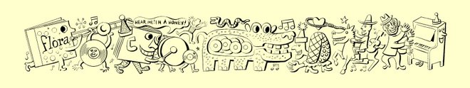
Railroad Town (detail 1)
 This is a print detail of Railroad Town, a 1951 Jim Flora woodcut. What you see above is approximately one-tenth of the entire 11" x 22.5" work. The rest is equally outrageous.
Barbara and I just returned from Knoxville, where we oversaw proofs for numbered, archival-quality limited edition relief prints of this iconic Flora work. All prints are restruck from the original Flora-cut block, and the edition will be produced by Yee-Haw Industrial Letterpress. Prints should be available in late Spring '07. More details forthcoming. And yes, we will post the entire Railroad Town panorama shortly.
Saturday, March 31, 2007
The perils of owning too many records ...
 Holly of Sweetheartville, a self-described "bitch kitty on wheels," finds a vintage Flora cover in—well, you'll never guess where.
She also observes that "covering a dining room wall with record sleeves hung with thumb tacks [is] too college." Perhaps decoratistas can agree on a Flora exemption.
UPDATE (02 MAY 07): Mr. Hall wonders if we're "making fun of [Mrs. Hall] in some way." No way!
Subscribe to:
Posts (Atom)


