Letter from Jim to his longtime friend Gene Deitch, 1972
Showing posts with label typography. Show all posts
Friday, June 23, 2017
Thursday, October 14, 2010
life in the food chain
Half-page from unfinished and untitled hand-painted children's book prototype, ca. early 1960s. The project includes ten words (e.g., "automation," "characteristic," "evident," "powerful") defined, pronounced and illustrated for young readers. A previous partial page ("fantasy") appeared on this blog in November 2008.
Labels:
1960s,
animals,
cats,
children's books,
dogs,
food + drink,
kids,
typography
Thursday, September 16, 2010
Flora Mambo font
New from P22 Type Foundry:
Based on playful hand-lettering from the 1955 Jim Flora Mambo For Cats RCA Victor album cover, the set includes "Flornaments," consisting of 72 miniature figure icons (dingbats) from Flora artworks. Samples:
Labels:
alphabet,
birds,
chic fashion,
dogs,
Floraphiles,
Mambo For Cats,
typography
Friday, July 9, 2010
typographical puzzler
The above typography appears on the covers of at least three RCA Victor LPs from 1956 and 1957, one by pianist Hal Schaefer, another by polymath-bandleader George Russell, and a third by saxophonist/clarinetist Hal McKusick. Of the series, Schaefer explained: "I was invited to participate in The RCA Victor Jazz Workshop. You had to be a composer, arranger and instrumentalist, all rolled into one." (Which abundantly explains Russell's inclusion.)In each case, the album covers are photographic, the "Jazz Workshop" logo branded in a corner. There's no typographical credit, yet the intricate lettering appears to be the handiwork of Flora, who often toyed with typography and illustrated dozens of RCA Victor (front and back) covers between 1954 and 1961. The letter fills reflect Flora's painstaking mischief.
One Floraphile insists on the benefit of the doubt. That would be me. Until proven wrong, I remain insistent.
Tuesday, July 6, 2010
Redskin Romp (typography)
Hand-lettered typography from cover of Charlie Barnet's 1955 compilation Redskin Romp 7" EP (also released as a 12" LP). Barnet (1913-1991) was a Swing Era bandleader and saxophonist whose first 78 rpm hit, "Cherokee," released in 1939, inspired the Indian-themed title of this 33-1/3 rpm hi-fi retrospective. Above is a section of the full cover; that's a non-lookalike caricature of Barnet in the lower left.
Labels:
1950s,
jazz,
RCA Victor,
record covers,
typography
Saturday, June 5, 2010
Jolly birthday
Peter Ceragioli Jr. was born this day in 1932. You may not recognize this West Coast jazz pianist, accordionist, and composer by his birth name. Beyond TV and film soundtrack cognoscenti, he's probably obscure even by his stage name—Pete Jolly. The keyboardist was a child prodigy on accordion, as spaceagepop.com points out:When he was eight, he made his first broadcast appearance, billed as "The Boy Wonder Accordionist" on CBS Radio's Hobby Lobby. The show's emcee messed up his name, announcing him as "Pete Jolly," but the boy liked the sound of it and used it ever after.Though his name is little recognized today, Jolly had a long, distinguished recording, composing and performing career. To Floraphiles, however, he is a household name, having been idiosyncratically rendered by the artist twice (in duo and trio releases) on 1955 RCA Victor 7" EP covers. In each case, Flora's caricature in no way resembled a recognizable human being. But then, Flora always insisted he "couldn't do likenesses." Original copies of both covers are extremely rare and highly sought by Flora collectors.
We issued a screen print of the Pete Jolly Duo cover in 2007.
I spoke to Jolly briefly before he passed away in 2004. I was soliciting quotes for our first volume of Floriana, The Mischievous Art of Jim Flora, the anthology that contained most of the artist's album cover illustrations. Having tracked down Jolly thru the L.A. musician's union, I gave him a call. He had no recollection of either EP cover and claimed never to have heard the name Jim Flora. Though Jolly was a gentleman to chat with, I came away from the conversation without a quote.
Labels:
1950s,
art prints,
checkerboard coloring,
instruments,
music,
RCA Victor,
record covers,
typography
Monday, March 8, 2010
Love (and some of its aspects)
Detail, The Many Aspects of Love, tempera on board, mid-1990s (and pre-dated by a pen & ink drawing). Not a top-tier work, the above partial reflects the extended mayhem. While there's plenty of vestigial Flora mischief (note demons in the head at left), works like The Many Aspects veer perilously close to self-parody. The complete work has not been published.
Labels:
1990s,
details,
food + drink,
paintings,
sex,
typography
Wednesday, January 27, 2010
The Day the Cow Sneezed
For years we've attempted to interest publishers in reprinting Jim Flora's 17 popular children's books. At the top of our wish-list were four titles: The Fabulous Firework Family (1955); The Day the Cow Sneezed (1957); Charlie Yup and His Snip-Snap Boys (1959); and Grampa's Ghost Stories (1978). We consider these the top-tier Flora kiddie books on an artistic level—with The Day the Cow Sneezed the most outlandish of the quartet.We've had inquiries, offers, meetings, draft agreements, proposals—and subsequent turndowns from six or seven publishers (we've lost count). Reasons vary, but they never seem to have much to do with the quality of the books. They are business decisions, which we're in no position to second-guess.
Patience has paid off, as we recently signed with Enchanted Lion Books to reprint Cow Sneezed in Fall 2010. Publisher Claudia Zoe Bedrick is a Floraphile, and depending on the success of the first reprint, she hopes to continue republishing two Flora titles a year. There is even the possibility of printing Grampa's Ghost Stories, a two-color format work which contains some of Flora's most bizarre figures—in an all-new full-color edition.
Saturday, November 7, 2009
Meow! Introducing the Mambo Mini
Our large (20" x 20") Mambo For Cats limited edition screen print is almost sold out. We're now offering a miniature (7" x 7") giclée open edition print of this renowned Flora 1955 RCA Victor LP cover. At $25.00, it's a great alternative for those on a limited budget—or with limited wall space.
Labels:
1950s,
art prints,
cats,
checkerboard coloring,
Mambo For Cats,
RCA Victor,
record covers,
typography
Saturday, September 26, 2009
Love Is Like Park Avenue
You've probably never heard of Alvin Levin. Neither had we. The intriguing rediscovery of Levin is chronicled by New Directions Senior Editor Declan Spring at The Front Table.
The wonderful Flora woodcut, like so many of the artist's early cuts, cannot be located.
Labels:
1940s,
architecture,
cars,
Little Man Press,
Robert Lowry,
typography,
woodcuts
Saturday, September 5, 2009
aspects (typography)
Flora loved experimenting with hand-typography throughout his career, from the 1930s to the 1990s. (Click on tag below to see previous examples.) He occasionally created anthropomorphic letters. The above detail derives from an undated 1990s-era painting entitled The Many Aspects of Love. The large-scale tempera is a lower-tier work reflecting Flora's libidinous streak with cartoonish figures, a recurring theme which usually makes us cringe. However, the lettering of each word in the tableau demonstrates Flora's playful approach to the alphabet. We'll publish the other words in subsequent posts.
Labels:
1990s,
animals,
architecture,
details,
paintings,
typography
Sunday, August 16, 2009
Do you know your FGHIJKLs?
Get to know them — Flora-style! Individual letters culled from various works by the funky font master himself.
Labels:
1940s,
1950s,
1960s,
alphabet,
typography
Thursday, May 21, 2009
Louis Armstrong's Hot 5 print
Now available: a limited edition (25) fine art print of Flora's 1947 Columbia album cover for Louis Armstrong's Hot 5. This print was commissioned from Jim Flora Art by Hypergallery, a UK dealer who specializes in reproductions of classic album cover art, and is available exclusively through their website.The print was produced by Flora archivist Barbara Economon from a vintage printer's proof sheet in the Flora collection. Each print in the edition was hand-signed by Joel Flora, the son of the late artist, for added provenance. Besides being a fine artist in his own right, Joel was born in 1947, the same year his father produced the Armstrong illustration.
The work will not be reissued as a print in any other format in the future.
Labels:
1940s,
art prints,
Columbia Records,
instruments,
jazz,
music,
record covers,
typography
Saturday, May 9, 2009
The Rollicking Roller Skates
Dummy page, Columbia's Children's Album Sets, demo booklet, 1941, part of a series of homemade samples prepared by Flora for the Columbia Records art department. Flora was living in Cincinnati at the time, an Art Academy grad, newly married, barely making ends meet as a freelance commercial illustrator, and sidelining on Little Man Press projects with Robert Lowry. Within a year, Columbia art director Alex Steinweiss offered Flora a job. Within two years, Flora had replaced Steinweiss as AD.The entire series of demo booklets was reproduced in The Curiously Sinister Art of Jim Flora, along with other Cincinnati-era artifacts.
Saturday, March 28, 2009
Robert Lowry @ 90
Robert Lowry (1919-1994) would turn 90 today. Don't expect a presidential proclamation in commemoration of this troubled man's legacy. However, we salute the Little Man Press writer/editor for changing the course of Flora's career, and probably for influencing his art. It all began one day in 1938 when the volatile literary turbine accosted Flora on the Art Academy of Cincinnati campus and demanded the undergrad illustrator serve as art director for his fledgling independent press publication."I was intrigued by his verve and the wild look in his eyes," recalled Flora in a 1987 autobiographical essay. "Lowry at the time was only seventeen or eighteen but he had been a child prodigy and was enormously talented. We found an immediate rapport, and I slipped into the harness and became co-founder of the Little Man Press."
"Lowry had no money and I had only a string of zeros," Flora explained, "so we decided to sell subscriptions to our nonexistent magazine. We tackled and browbeat everyone we knew on the campus of the University of Cincinnati. It was backbreaking work but we eventually squeezed $300 out of our subscribers and bought a press."
"We reasoned that the average little man during the depression might not be able to afford a big expensive magazine, so we published each article or story as a separate booklet and supplied a box so that our little man could assemble his own magazine. The box idea was a brainstorm about two centuries ahead of its time and was soon abandoned in order to avoid bankruptcy."
"We had only enough type to set two pages at a time. It was thus necessary to learn to calculate space very accurately. We were forced to set and print the first and last pages of our booklets, then break up the type and set the second and the next to last page and so on, until we met in the middle. If we undercalculated I made an illustration to fill the blank space. We didn't dare overcalculate and never did."
Two-page spread, Murderpie, 1939"Bob was full of juice, a constant eruption, like a volcano," Flora told Lowry biographer Billie Jeyes. "He was constantly testing me, always pushing me to the limits. One day I was at the art academy, and Bob came to see me because he wanted me to do something. I was very busy at the time, and he kept pushing. So I hit him, in the chest. From then on we were on an even keel."
Tuesday, March 10, 2009
Bix @ 106
Leon Bix Beiderbecke was born today in 1903. Beiderbecke, a cornetist (caricatured above left by Flora in 1947) and pianist, was a stylistic catalyst in the formative years of jazz. Bix and trumpeter Louis Armstrong were the two most pivotal horn players of the 1920s, though their approaches differed markedly. Beiderbecke has been described as the first real modernist in jazz, though that doesn't explain his enduring appeal. (Each year when the calendar flips to February 10, WKCR radio in New York devotes a full day to his complete recordings.) Beiderbecke's historic magnitude prevails despite the fact that the "young man with a horn" drank himself to death at age 28, and his entire recording career spanned just six and a half prolific years. Music consumed Bix, while Bix consumed bathtub gin. As author Richard Hadlock wrote, Bix "was both an artist and a speakeasy entertainer, both a middle-class mama's boy and a nomadic bum, both a star performer and a jobless horn player."What was in Bix's brew? Trumpeter Randy Sandke explains: "With the advent of prohibition in January 1920, the simple act of taking a drink containing alcohol became a criminal offense. Bootleg liquor became a witch's brew that could contain poisonous ingredients. A sample sold in the streets of Harlem was taken to a lab and analyzed. It was found to contain wood alcohol, benzene, kerosene, pyridine, camphor, nicotine, benzol, formaldehyde, iodine, sulphuric acid, soap, and glycerin. People who consumed this hazardous concoction often experienced dizziness, blackouts, hair loss, fluctuations in weight, advanced aging, partial blindness and paralysis. It is known that Bix exhibited most if not all of these symptoms." Despite these alcoholic maladies, Bix's complexion was reportedly less scarlet than Flora's portrait.
"Tram" was C-melody saxophonist Frank Trumbauer, with whom Bix made some of his most monumental recordings. A 4-cd box set with the same title as the Flora 78 album above contains all of their essential recordings. Bix was a legendary artist who often recorded with lesser talents and behind dreary vocalists, and the apparent filler on this collection simply reflects Beiderbecke's varied gigs. However, when teamed with high-caliber players like Trumbauer, multi-instrumentalist Adrian Rollini, guitarist Eddie Lang, and violinist Joe Venuti, Beiderbecke's stature is magnified, his reputation self-evident. Seek out his extended solo on "I'm Coming Virginia" by the 1927 Trumbauer Orchestra. It's scary beautiful.
Gary Giddins said: "Beiderbecke's originality made him one of the first white jazz musicians to be admired by black performers. Louis Armstrong recognized in him a kindred spirit, and Rex Stewart exactly reproduced some of his solos on recordings. Beiderbecke's influence on such white players as Red Nichols and Bunny Berigan was decisive. Although he was largely unknown to the general public at the time of his death, he acquired an almost legendary aura among jazz musicians and enthusiasts."
Bix was born and raised in Davenport, Iowa. Flora also grew up in the midwest (Bellefontaine, Ohio), and caught the jazz bug as a youth. "We had dancebands that came through all the time and they were mostly like Red Nichols and Bix Beiderbecke," Flora told interviewer Angelynn Grant in 1990. "Beiderbecke recorded less than 100 miles away from Bellefontaine, in Indiana. His label, Gennett Records, was in Hammond, Indiana, which was about 75-80 miles from Bellefontaine. So that was the tradition there."
Labels:
1940s,
Bix,
Columbia Records,
instruments,
jazz,
music,
typography
Thursday, December 25, 2008
Monday, November 24, 2008
Wednesday, November 12, 2008
the evolution of Eulenspiegel
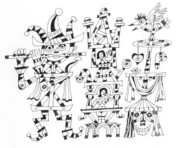
Pencil sketches for Till Eulenspiegel LP cover, 1955. The above skeletal figures eventually morphed into this rough layout:
... which was refined as this unfinished tempera setting:
... which evolved into this finished RCA Victor Red Seal cover:
Till Eulenspiegel was an impudent prankster in German folklore. Flora rendered several pen and ink drawings of the trickster in the 1990s. Perhaps he recognized a kindred spirit.
Labels:
1950s,
1990s,
animals,
architecture,
bad behavior,
birds,
chaos,
checkerboard coloring,
music,
RCA Victor,
sketches,
typography,
violence
Wednesday, October 29, 2008
loan shark
Commercial illustration, late 1950s, publication unknown. Tempera mechanical found in the Flora archives. The illustration's theme has contemporary resonance in the wake of the subprime meltdown.
Labels:
1950s,
animals,
bad behavior,
commercial illustrations,
typography,
violence
Subscribe to:
Posts (Atom)


