
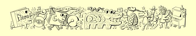
 The above typography appears on the covers of at least three RCA Victor LPs from 1956 and 1957, one by pianist Hal Schaefer, another by polymath-bandleader George Russell, and a third by saxophonist/clarinetist Hal McKusick. Of the series, Schaefer explained: "I was invited to participate in The RCA Victor Jazz Workshop. You had to be a composer, arranger and instrumentalist, all rolled into one." (Which abundantly explains Russell's inclusion.)
In each case, the album covers are photographic, the "Jazz Workshop" logo branded in a corner. There's no typographical credit, yet the intricate lettering appears to be the handiwork of Flora, who often toyed with typography and illustrated dozens of RCA Victor (front and back) covers between 1954 and 1961. The letter fills reflect Flora's painstaking mischief.
One Floraphile insists on the benefit of the doubt. That would be me. Until proven wrong, I remain insistent.


2 comments:
Nothing in the Flora family archives that supports your theory, I take it? Anything close? I'll give you the benefit of the doubt and say that I agree with you, it looks an awful lot like Flora to me. But I've been fooled before...
You know, having said that, the interior detail of the letters looks a bit rough. Maybe he did it in a hurry, but there's no detail to those details. I'm not so sure anymore...
Ern: I haven't been fooled before (methinks). In the absence of proof, my gut says Flora. Granted there were other lookalike images on RCA during the period, but each had telltale clues that affirmed NOT Flora. The casual "hand" on this one strongly suggests Jim. Re: the interior detail looking "a bit rough"—that's the clincher. Flora was not a perfectionist; he always retained a playful human element. Equally revealing is the fact that each letter has its own unique fill pattern, rather than a repeating template. Absent documentation, I wouldn't insist 100%, but this one's in the high 90s.
Post a Comment